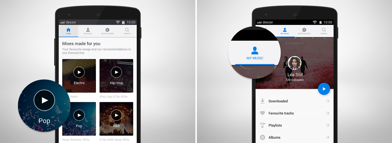
The latest version offers simplified navigation and improved layouts to help you get to your music quickly, without having to switch between tabs often.
Mixes you’ve already made are now more visible on the homepage and the Flow function takes pride of place, so you’re one tap away from instantly queued music picked by Deezer for you. Heavy users can now create their own record shelf, enabling them to more easily organise music into playlists and favorite tracks. As the app has been rebuilt from scratch, there are also a whole load of tweaks to artist pages, albums and playlists.
In an interview about the new experience, it sounds like Deezer may have been given a nudge by Google to ensure the app conforms with its design guidelines. Deezer has been getting rather serious in the streaming space of late, adding podcasts, offline playback for paying users and football to its audio offer in a bid to ensure its users aren’t tempted to go elsewhere. There’s still no dedicated folk music section though :( Deezer was set to IPO in October, but it looks like these plans have been abandoned following a poor showing from Pandora and more stiff competition in the shape of Apple Music. The team has promised yet more new features on the way soon. ➤ Looking Good Android! Discover Our Shiny New Android App And The People Behind Its Conception [Deezer]
